 |
|
PAST
EXHIBITIONS
|
 |
|
|
Cursive:
D. Dominick Lombardi, Creighton Michael,
David Rubin, Hilda Shen, Rebecca Smith
March 13 - April 13, 2005
Cursive refers to script defined by long
flowing, connected lines that developed out of picture symbols into formal
writing and then to a demotic style, called cursive. Although writing
dates back to Sumerian cuneiform the type of cursive stroke that serves
as inspiration and integrative element for this show comes from a later
development associated with the Hellenistic demotic Egyptian scripts,
written in a flowing style, thereby cursive. In China also when Emperor
Qin Shi Huang ordered his Prime Minister Li Si to standardize the writing
system in an effort to unify regional communication, a running script
was developed. Called caoshu (grass writing or cursive hand), it is a
rapid stroke thus it was used for making quick but rough copies and is
sub-divided into two parts: zhangcao and jincao . For the sake of this
essay it is jincao with which we are concerned in which the characters
are written fast and the strokes run together, are sometimes joined and
vary in size within the same piece of writing. Featuring the art of five
artists D. Dominick Lombardi, Creighton Michael, David Rubin, Hilda Shen
and Rebecca Smith this show conveys the essential character of cursive
writing not as literal reference, but rather as inspiration and synthesis
to the varied artistic expressions and media.
 |
|
Lombardi, Head # 1,030, 2004, India
ink on paper, 14" x 14" Head # 485 (mixed media wall sculpture)
2004, 15.5" x 13.5 x6" Head # 1,034, 2004, India ink on
paper, 14" X 14" Head # 1,029, 2004, India ink on paper,
14" X 14' |
D. Dominick Lombardi’s Post Apocalyptic Tattoo
installation depicts a series of physically distorted characters informed
by the “low art” of tattoo that because they appear as genetic
hybrids also refer to recent experimentation in genetic engineering. As
the artist describes them these “apocalypse survivors, build their
self-assured attitudes on the fact that everyone’s physical deficiencies
are obvious- so no one feels weak, unequal or ashamed.” Whether
Lombardi’s figures are conveyed as drawings, paintings or sculpture
they rely heavily on line whose power lies in its running flow and fluid
curve. Lombardi’s mutant forms seem to roll into themselves like
brain convolutions combining into creatures whose appearance ranges from
somewhat recognizable humans to flat script designs. As post-apocalyptic
survivors in their evolutionary process they’ve needed to speciate
in order to survive their polluted environment to become new forms that
in their multi-variance and strength serve as compelling tributes to humanity.
Creighton Michael’s dimensional drawing developed
out of “episodes of marking activity varying both in duration
and intensity that examines in physical terms the process and structure
of drawing.” In their three-dimensionality his constructed drawings
combine shapes composed of hand worked wire, rope, glue, plastic or
rubber into drawing entities. While discrete units they are simultaneously
viewed as collective harmonies that rhythmically wend and weave their
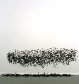
way through cursive paths. Michael’s series entitled Squiggle
as a subgroup of the Dimensional Drawing category made of rope that
has been coated with paper pulp and graphite mix to result in cursive
squiggles that can be read as calligraphic strokes or drawing lines.
Although more than ephemeral lines in a drawing due to their concrete
construction, these linear shapes transition into a time related installation
genre. They appear to be in the process of breaking away from their
matrix to casually fall and collect on the gallery floor. Consequently,
they are not read as fixed signs but rather they’re taken to
be in constant flux. They are also multi-dimensional not only in their
sculpturality but also because of the shadows they project on the
white walls that formulate another dimension altogether. Appearing
like manifestations of the indefinable these delicate lines fit well
into Ouspensky’s notion of parallel dimensional existences.
|
 |
|
Michael, SQUIGGLE, 2005 Paper,
graphite and cotton rope Dimensions vary according to installation |
|
|
|
Rubin, Pollinating, 2004 Gel and
Roller Pens on Paper 17" x 14" |
David S. Rubin’s curving, branching, flowing drawing line
owes its genesis to the automatist practices of 20th Century Surrealism
as well as to 19th Century spiritualist practices. The resulting shapes
appear as chandelier forms or blood corpuscles or even planetary orbs
that at points ebb and recede, or expand and increase, bunching up and
dispersing. He conveys the connectivity of all things through images of
colorful circular linear shapes that appear to interweave and wend their
way through a cosmic journey. Rubin’s work can be read in terms
of string theory, which is multidimensional containing twisting orbifolds
exploded from a Euclidean perspective of three-dimensional space. Starting
as points merging with other points to formulate lines these can merge
into a plane expanding the coordinated reference. However, rather than
describing nature’s oneness in terms of geometric considerations,
Rubin prefers tosituate himself in the less definable interstices between
his circular shapes. Consequently, as he describes this state, he loves
“being right on the cusp, at that fine point between dualities—where
a push one way or the other would be too finite.”
Hilda Shen's site-specific installation pieces employ the imagery
of fingerprints imprinted on shapes that reference Chinese scholar rocks
related to the practice of landscape painting, calligraphy as well as
meditation. This body of work continues her earlier practice seen in her
China2000 show of creating pieces about the continuity and overlap between
human and geologic history depicted in multiple perspective and media.
Although ciphers of identity fingerprints are also round, curving, circular
forms that relate to cursive strokes not only in their continuous thrust
but also in their free-flowing characteristics. Shen’s reference
to scholar rocks is also multivalent for not only are they minerals but
they attain their form from atmospheric conditions such as repetitive
water flow patterns, thereby are also imprints of nature while also relating
to the cursive script and calligraphy. A rock and its accompanying spirit
(ch’i) in Chinese history are seen as the underlying scaffold of
the heavenly and earthly planes and are referred to as the “roots
of the clouds.” Depending on the amount and quality of its spirit
a rock or a person can possess more or less energy. According to Chinese
art theory, rocks and people should contain the essence of the Tao therefore
those without energy are dead and lifeless and cannot be painted. For
a rock’s form to be discernible thereby depictable, it must be spiritually
imbued like P’an Ku’s the primordial entity’s head,
which was transmuted into rock. As Lu Cha’i proposed, the main consideration
in depicting them is that “each brushstroke must move and turn with
abrupt stops sinuous as a dragon. [1]
|
|
Shen, Yosemite, 2004 Ink, wax, paper
118"(height) x 113.5"(width) |
|
 |
|
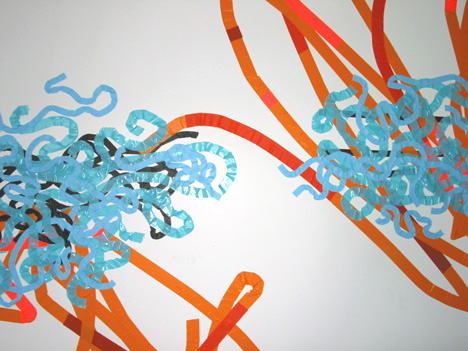
Smith, Elizabeth
Bay Tangle, Color Tape Drawing, 2003, 8'10" X 15'5" |
|
Rebecca Smith’s lyrical, colorful forms are created for specific
spaces whose dynamic results from the artist’s relationship to the
environment during specific conditions. In her recent colored tape drawing
installation entitled Shorthand Feminine, 2005 Smithexamines the components
of shorthand script not only for the purpose of comprehending it and exposing
its ramifications on power and gender relations within the workplace,
but she’s also studying it in terms of its formal value. Whether
Pittman or Gregg, shorthand is an opaque language inaccessible to most
people yet women were expected to master its forms for the purpose of
conveying male communications. In this series she renders texts written
in Gregg shorthand using pastel colors, thereby creating a space configured
with chromatic language. Overlain on the field of writing are several
forms built from accumulated layers of tape bands of different colors
and increasingly greater lengths that form a “hieroglyph”
of her own invention that denotes a joyous, striding female figure. On
a visual level it is pleasing to look at, yet when viewed close-up the
Arabic-looking strokes that appear to be grounded in a pictorial aesthetic,
confound traditional readings and result in script-like strokes. Smith
engages with the intricacies of language and works with text that while
sharing some similarity with shorthand clearly engages with alternative
readings that are not fixed but rather redefine the nature of language
in their multivalent significance.
[1] Mai-Mai Sze, The Way of Chinese Painting: its Ideas
and Techniques, (Random House, New York , 1956) p. 192
|
 |
